Saturday, January 10, 2015

How to Calculate the Geometric Mean

The Geometric Mean of a data set  is given by:


NB: The geometric mean of a data set is less than the data set's arithmetic mean unless all members of the data set are equal, in which case the geometric and arithmetic means are equal.


Worked Example

A maths tutor observed that during the last academic year a student increased his score by 20% in the first semester, 30% in the second semester and 50% in the third semester. What is the average increase in the performance of the student?


Solution 1

Arithmetic Mean


Solution 2

Geometric Mean


How to Calculate the Mean or Average ( Arithmetic Mean)

The mean is the average of the data set which is given by the sum of all measurements divided by the number of observations in the data set. 
The mean is given by the formula:


Worked Example

The amount of money spent daily on food by a certain family for a particular week were respectively as follows:
$65 , $45 , $ 40,  $45, $45, $ 50, $ 60.
Find how much the family expects to spend on food on a given day.

Solution


Data Analysis - Descriptive Statistics

There are two equally important Statistics in any Data Analysis:

Descriptive Statistics is the term given to the analysis of data that helps describe, show or summarize the basic features of data in a meaningful way. Descriptive statistics aim to quantitatively summarize a sample, rather than use the data to learn about the population that the sample of data represents.

Inferential statistics is the analysis of data that involves making predictions or inferences about a population from observations and analyses of a sample.

Using Descriptive Statistics for Data Analysis

Descriptive Statistics form the basis of the initial quantitative description of the data as part of a more extensive statistical analysis, or they may be sufficient in and of themselves for a particular investigation.
Some measures that are commonly used to describe a data set are:


Measures of Central Tendency


The central tendency of a distribution is an estimate of the "center" of a distribution of values. There are three major types of estimates of central tendency:
  • Mean - the average of the data set which is given by the sum of all measurements divided by the number of observations in the data set
  • Median - the middle value that separates the higher half from the lower half of the data set after the data set has been arranged in ascending order. 
  • Mode - the most frequent value in the data set.

The following measures of central tendency can be classified under mean:

  1. Arithmetic Mean
  2. Geometric mean
  3. Harmonic mean
  4. Weighted mean
  5. Truncated mean
  6. Interquartile mean
  7. Midrange
  8. Midhinge
  9. Trimean
  10. Winsorized mean
  11. Geometric median
  12.  Quadratic mean (root mean square)


Measures of Spread or Dispersion or Variability


Measures of dispersion are descriptive statistics that describe how similar a set of scores are to each other or Measures of dispersion measure how spread out a set of data is.
  • The more similar the scores are to each other, the lower the measure of dispersion will be 
  • The less similar the scores are to each other, the higher the measure of dispersion will be 
  • In general, the more spread out a distribution is, the larger the measure of dispersion will be.
A measure of statistical dispersion is a non-negative real number that is zero if all the data are the same and increases as the data become more diverse.

Measures of dispersion that have dimensions


These measures have the same units as the quantity being measured.

  • Standard deviation
  • Range
  • Interquartile range (IQR)
  • Semi-interquartile range(SIR)
  • Interdecile range (IDR)
  • Mean difference
  • Median absolute deviation (MAD)
  • Average absolute deviation (Average deviation)
  • Distance standard deviation

Measures of dispersion that are dimensionless


These measures have no units even if the variable itself has units.

  • Variance (the square of the standard deviation)
  • Variance-to-mean ratio
  • Allan variance
  • Hadamard variance
  • Coefficient of variation
  • Quartile coefficient of dispersion
  • Relative mean difference
  • Gini coefficient
  • Kurtosis
  • Skewness


The Distribution or Measure of Shape

The distribution of a statistical data set (or a population) is a listing or function showing all the possible values (or intervals) of the data and how often they occur.The distribution is a summary of the frequency of individual values or ranges of values for a variable. The simplest distribution would list every value of a variable and the number of persons who had each value.


The most common way to describe a single variable is with a frequency distribution. Depending on the particular variable, all of the data values may be represented, or you may group the values into categories.

Frequency distributions can be depicted in two ways, as a table or as a graph.

The following Statistical graphs can be used to describe a data set. 

  • Bar chart
  • Box Plot
  • Control Chart
  • Histogram
  • Ogive
  • Pie Chart
  • Scatter Plot ( Scatter Diagram)
  • Steam-and-leaf Plot

The following measures of shape can be used to describe a data set.

  • Variance
  • Kurtosis
  • Skewness


Friday, January 9, 2015

Using Microsoft Office Excel for Data Analysis - Overview of Microsoft Excel

Screenshot of Microsoft Excel Worksheet

Microsoft Office Excel is a powerful tool you can use to create and format spreadsheets, and analyze and share information to make more informed decisions. With the Microsoft Office Fluent user interface, rich data visualization, and PivotTable views, professional-looking charts are easier to create and use. Microsoft Office Excel , combined with Excel Services, a new technology that will ship with Microsoft Office SharePoint Server, provides significant improvements for sharing data with greater security. You can share sensitive business information more broadly with enhanced security with your coworkers, customers, and business partners. By sharing a spreadsheet using Microsoft Office Excel and Excel Services, you can navigate, sort, filter, input parameters, and interact with PivotTable views directly on the Web browser.


Create Better Spreadsheets


  • Take advantage of the Office Fluent user interface
  • Enjoy increased spreadsheet row and column capacity (1 million rows by 16,000 columns)
  • Quickly format cells and tables
  • Formulas authoring experience 
  • Create professional-looking charts 
  • Use Page Layout View 

Improve Spreadsheet Analysis


  • Use conditional formatting 
  • Sorting and filtering 
  • Create a PivotTable or PivotChart view 
  • Full support for Microsoft SQL Server Analysis Services

Share spreadsheets and business information with others


  • Use Microsoft Office Excel and Excel Services to more securely share spreadsheets with others
  • Create business dashboards from spreadsheets and share within a portal
  • Save as XPS or PDF for easier sharing
  • New Excel XML Format enables a more efficient exchange of information

Manage business information more effectively


  • Centrally manage sensitive information by publishing spreadsheets to Office SharePoint Server
  • Protect confidential business information 
  • Connect to external sources of information using the Data Connection Library
  • Take advantage of the Excel calculation engine in other applications

Source: Microsoft Office Excel Product Overview

Using Python for Data Analysis - Overview of Python

Screenshot of Python IDLE Shell

Python is an easy to learn, powerful programming language. It has efficient high-level data structures and a simple but effective approach to object-oriented programming. Python’s elegant syntax and dynamic typing, together with its interpreted nature, make it an ideal language for scripting and rapid application development in many areas on most platforms.

Source: Python

Using R for Data Analysis - Overview of R

Screenshot of R Console

R is a language and environment for statistical computing and graphics. It is a GNU project which is similar to the S language and environment which was developed at Bell Laboratories (formerly AT&T, now Lucent Technologies) by John Chambers and colleagues. R can be considered as a different implementation of S. There are some important differences, but much code written for S runs unaltered under R.

R provides a wide variety of statistical (linear and nonlinear modelling, classical statistical tests, time-series analysis, classification, clustering, ...) and graphical techniques, and is highly extensible. The S language is often the vehicle of choice for research in statistical methodology, and R provides an Open Source route to participation in that activity.

R is an integrated suite of software facilities for data manipulation, calculation and graphical display. It includes
  • an effective data handling and storage facility,
  • a suite of operators for calculations on arrays, in particular matrices,
  • a large, coherent, integrated collection of intermediate tools for data analysis,
  • graphical facilities for data analysis and display either on-screen or on hardcopy, and
  • a well-developed, simple and effective programming language which includes conditionals, loops, user-defined recursive functions and input and output facilities.

Source: r-project

Using EPI Info for Data Analysis - Overview of EPI Info

Screenshot of EPI Info Menu


Epi Info™ is a data collection, management, analysis, visualization, and reporting software for public health professionals. It is used worldwide for the rapid assessment of disease outbreaks; for the development of small to mid-sized disease surveillance systems; as ad hoc components integrated with other large scale or enterprise-wide public health information systems; and in the continuous education of public health professionals learning the science of epidemiology, tools, and techniques.
Epi Info™ is a trademark of the Centers for Disease Control and Prevention (CDC). The software is in the public domain and freely available for use, copying translation and distribution.

Epidemiologic Analysis

Transform data and perform many types of statistical analyses including 2x2 tables, matched-pair case control studies, and regression analysis using the new Visual Dashboard feature. Robust charting capabilities are also included.

Create Forms & Enter Data

Quickly create questionnaires and data entry forms. Epi Info™  automatically creates a database from the questionnaire and allows users to enter new data, modify existing data, or search for records.

Generate Maps

Display geographic maps with data collected using Epi Info™  or stored in a variety of file formats and database systems. Identify clusters and trends and incorporate additional layers to show relationships of data points


Source: CDC ( Centre for Disease Control)

Using SPSS for Data Analysis - Overview of SPSS

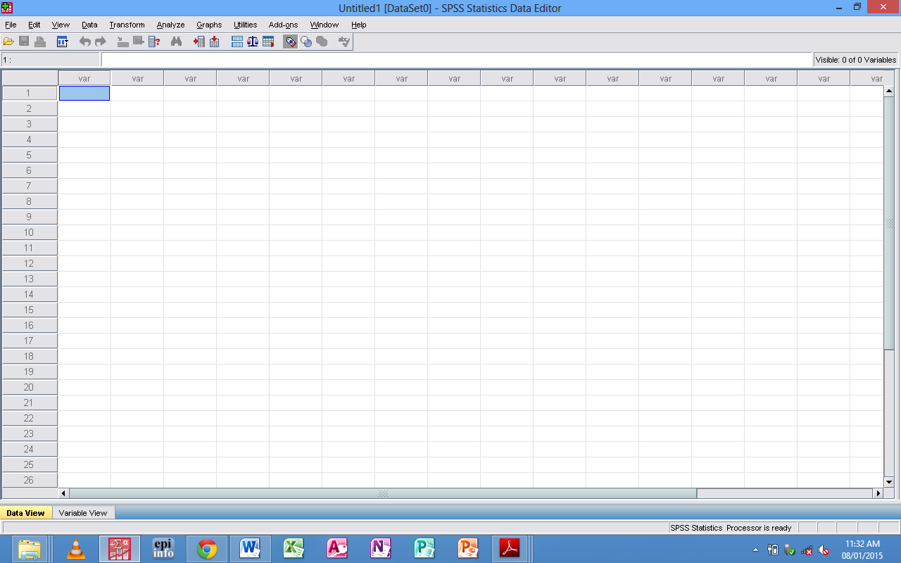
SPSS Data Editor
Screenshot of SPSS Data Editor

SPSS Statistics provides a powerful statistical-analysis and data-management system in a graphical environment, using descriptive menus and simple dialog boxes to do most of the work for you. Most tasks can be accomplished simply by pointing and clicking the mouse.

In addition to the simple point-and-click interface for statistical analysis, SPSS Statistics provides:

Data Editor. The Data Editor is a versatile spreadsheet-like system for defining, entering, editing, and displaying data.

Viewer. The Viewer makes it easy to browse your results, selectively show and hide output, change the display order results, and move presentation-quality tables and charts to and from other applications.

Multidimensional pivot tables. Your results come alive with multidimensional pivot tables. Explore your tables by rearranging rows, columns, and layers. Uncover important findings that can get lost in standard reports. Compare groups easily by splitting your table so that only one group is displayed at a time.

High-resolution graphics. High-resolution, full-color pie charts, bar charts, histograms, scatterplots, 3-D graphics, and more are included as standard features.

Database access. Retrieve information from databases by using the Database Wizard instead of complicated SQL queries.

Data transformations. Transformation features help get your data ready for analysis. You can easily subset data; combine categories; add, aggregate, merge, split, and transpose files; and more.

Online Help. Detailed tutorials provide a comprehensive overview; context-sensitive Help topics in dialog boxes guide you through specific tasks; pop-up definitions in pivot table results explain statistical terms; the Statistics Coach helps you find the procedures that you need; Case Studies provide hands-on examples of how to use statistical procedures and interpret the results.


Command language. Although most tasks can be accomplished with simple point-and-click gestures, SPSS Statistics also provides a powerful command language that allows you to save and automate many common tasks. The command language also provides some functionality that is not found in the menus and dialog boxes.


Source: IBM SPSS